Click Options on the left menu to access the General options for your account. Then click the Colors tab at the top of the page:
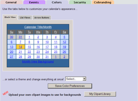
The Color Editor
The Color Preferences editor is a powerful and easy way to dynamically customize your calendar's appearance.
The editor functionality is split across 3 tabs: Block View, List Views, and Arrow Buttons
Webmasters: To make localendar seamlessly fit into your site, you'll want to change the calendar palette to match what you're using on your existing web pages.
If you want to make more sophisticated changes, you can use the CSS hooks localendar provides.
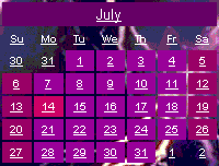
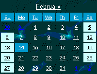
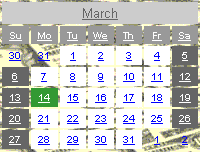
Block View
This is the view used by the default localendar Month display. You can customize the following features:
1. Calendar Title (if you supplied one) and the Month Name
2. Weekday Names
3. Previous/Next Month days
4. Weekdays
5. Weekends
6. Month-view Background
When you click on a Block View feature, an Options Palette appears to the right:
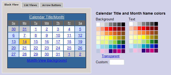
Click the foreground and/or background colors to customize the element. You can also enter a custom color value or make the background transparent for some elements.
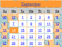
Using an image on the Block View background
When you select the Month-View background, the Options palette includes a drop-down list of images. This list contains some default background images provided by localendar, and any images you have uploaded.
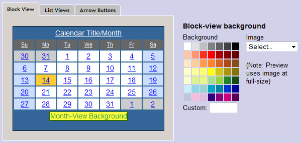
Page Refresh Required
If you upload your own image for the calendar background, you'll need to refresh your page before it appears in the dropdown list. Make sure to save any other color changes you have made before refreshing the page or they will be lost.
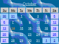
List Views
The list views are used by several of the localendar view styles. By default, your calendar's Day and Week views are configured as List views. It is also possible to set your default Month view to be a List view as well (under General Options).
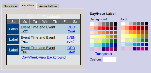
You can customize the following features:
1. Calendar Title (if you supplied one) and the Month Name
2. Label (Hour of Day on the Day View, Day of Week on the Week View)
3. Event Time and Text
4. Odd Row background color
5. Even Row background color
6. Day/Week-view Background
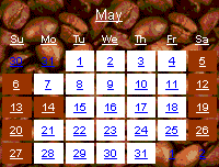
Using an image on the List View background
As with the Block View, you can use an image for this view's background. localendar provides some options, or you can upload your own.
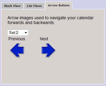
Arrow Buttons
The arrow buttons are used to move forwards/backwards to different days, weeks, or months (depending on your current calendar view). You can choose the arrow set to use from the drop-down list on this tab.
Themes
localendar has a collection of predefined colors settings called Themes (also known as "skins"). If you don't want to pick out your own color settings but you want a different look to your calendar, you can use one of these themes. Or, you can use a theme as a starting point and make your own changes from there.
Upload custom clip-art
You can access your personal clip-art library by clicking the "My Clipart Library" button on the Color Editor:
